-
Continue reading →: Top 20 Data Visualization Tools
Every researcher or practitioner of quality (or pretty much any other subject, for that matter) needs a great toolbox packed with flexible visualization tools. I am very happy to see this list of “Top 20 Data Visualization Tools” that came out last week. For me, it’s like a TO DO…
-
Continue reading →: Text Analysis Tutorial on Spam Email in R
Hi everyone – I just wrote a tutorial on text analysis in R using the tm and wordcloud packages. It’s my annotated version of one of the exercises in Conway & White’s “Machine Learning for Hackers”, and uses their data sets. I wrote an annotated version because I thought some of…
-
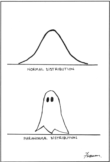
Continue reading →: Normal Probability Plots (QQ Plots) in R
Here’s a tutorial on how to tell whether your data are (approximately) normally distributed! qq-plot-75-925
-
Continue reading →: Blog Shui!
I’ve officially beautified and 5S-ed my blog today. Enjoy a NEW UPDATED SITE MAP too. Beautiful pictures courtesy of Doug Buckley at http://interactive.to – as usual. The picture here is one of Doug’s self portraits. If you are equally artistic, you will be able to see him in there.
-
Continue reading →: There Is No Process Until It Is Observed
(Image Credit: Doug Buckley of http://hyperactive.to) I realized today that there’s a little bit of a quantum effect in quality management: There is no process until it is observed. Here’s what I mean. In the August 2012 issue of Quality Progress, Lynne Hare writes about how simple flow charts can…
-
Continue reading →: Quality Feels Like Being in Love
(Image credit: Doug Buckley of http://hyperactive.to) I love Paul Borawski’s August discussion topic on ASQ’s View from the Q. Among other questions, he asks: When you’re in a culture of quality, how does it feel? Or, how do you feel? At the moment I’m intrigued by feelings and think more…
Hello,
I’m Nicole

Since 2008, I’ve been sharing insights and expertise on Digital Transformation & Data Science for Performance Excellence here. As a CxO, I’ve helped orgs build empowered teams, robust programs, and elegant strategies bridging data, analytics, and artificial intelligence (AI)/machine learning (ML)… while building models in R and Python on the side. In 2025, I help leaders drive Quality-Driven Data & AI Strategies and navigate the complex market of data/AI vendors & professional services. Need help sifting through it all? Reach out to inquire – check out my new book that reveal the one thing EVERY organization has been neglecting – Data, Strategy, Culture & Power.