Skip to content
(c) 2008-2024
Quality and Innovation
Search
About Nicole
Books
Consulting
Contact
Courses
Influential Voices (ASQ)
Posts (2008-2012)
Category:
Applied Statistics
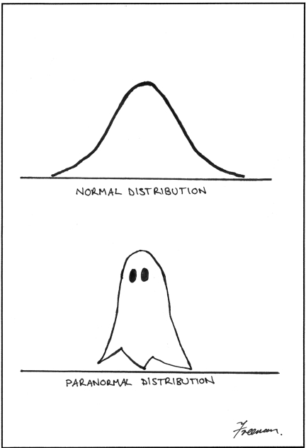
The Scariest Part of Corporate Halloween
Bayesian Analysis with Python by Osvaldo Martin
easyMTS: My First R Package (Story, and Results)
easyMTS R Package: Quick Solver for Mahalanobis-Taguchi System (MTS)
My First R Package (Part 3)
Logistic Growth, S-Curves, Bifurcations, & Lyapunov Exponents in R (Tidyversion)
How Linear Regression and Two-Way ANOVA are the Same
Next Page
Privacy & Cookies: This site uses cookies. By continuing to use this website, you agree to their use.
To find out more, including how to control cookies, see here:
Cookie Policy
Subscribe
Subscribed
Quality and Innovation
Join 255 other subscribers
Sign me up
Already have a WordPress.com account?
Log in now.
Quality and Innovation
Subscribe
Subscribed
Sign up
Log in
Report this content
View site in Reader
Manage subscriptions
Collapse this bar