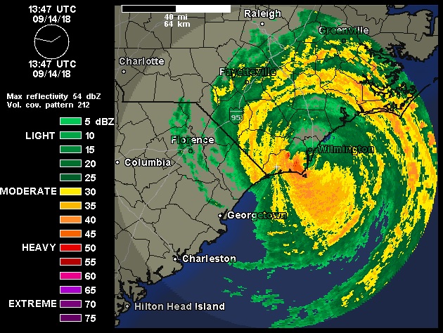
This article originally appeared on the Intelex Community on 9/14/2018 at https://community.intelex.com/explore/posts/why-fema-monitoring-waffle-house-weekendSometimes the most informative metrics show up in the strangest of places.Case in point: with a hurricane making landfall today in North Carolina, and the prospect for catastrophic flooding over the weekend and into next week, emergency managers are mobilizing for action – and if you’re in the path of the storm, you may be doing the same. Have you started monitoring the Waffle House Index? The US Federal Emergency Management Agency (FEMA) has.Originally devised by W. Craig Fugate, former FEMA Director, the Waffle House Index is based on the observation that the popular 24-hour breakfast chain has historically been unusually well prepared for disasters. Part of their business model is to be the spot for emergency personnel to rely on for their coffee and nourishment – a valuable role when power crews, rescue teams, and debris removal workers are working long, hard hours.To do this, they make sure all employees have disaster training and stock all their restaurants with generators, and have a reduced menu specifically to be offered in the aftermath of a disaster. Over time, this even led to a more formal partnership between the organizations. FEMA first responders are known to set up initial operations in Waffle House locations. Waffle House now reports the status of each location to FEMA after a disaster to facilitate data collection.The Waffle House Index is a red, yellow, or green marker placed on a map wherever a Waffle House location is found. Under normal conditions, the marker is green. If the restaurant has shifted into emergency operations and is offering their limited menu, the marker is yellow. If the marker is red, that means that the Waffle House is closed – either the site itself is damaged or destroyed, emergency staff can not reach the site, the emergency generators are down or out of fuel, or there is a food shortage. When FEMA sees one or more reds, they know an area is in particularly bad shape – and they’ll need to help.What can you learn about risk-based thinking from the Waffle House index? Three things: first, that you can (and should) look outside your organization for risk indicators that might help you make better (and faster) decisions, particularly when those risks are activated. Second, that you should explore crowdsourced risk data as a source of up-to-date information.And finally – if Waffle House is closed, there’s a serious problem.AdditionalReading: McKnight, B., & Linnenluecke, M. K. (2016). How firm responses to natural disasters strengthen community resilience: A stakeholder-based perspective. Organization & Environment, 29(3), 290-307.
Walter, L. (2011, July 6) What do waffles have to do with risk management? EHS Today. Available from https://www.ehstoday.com/fire_emergencyresponse/disaster-planning/waffles-risk-management-0706
“look outside your organization for risk indicators that might help you make better (and faster) decisions, particularly when those risks are activated. Second, that you should explore crowdsourced risk data as a source of up-to-date information.”
I agree. Also, just look at data close to where the action is (internal or external).
And don’t just look at aggregated data but dig into what individual data points tell you. Aggregated data is very useful but it also can mask meaningful insights available when data is looked at more closely. It isn’t a perfect match to Waffle House data but I think the principle is visible in the Waffle House example.
Since 2008, I’ve been sharing insights and expertise on Digital Transformation & Data Science for Performance Excellence here. As a CxO, I’ve helped orgs build empowered teams, robust programs, and elegant strategies bridging data, analytics, and artificial intelligence (AI)/machine learning (ML)… while building models in R and Python on the side. In 2025, I help leaders drive Quality-Driven Data & AI Strategies and navigate the complex market of data/AI vendors & professional services. Need help sifting through it all? Reach out to inquire – check out my new book that reveal the one thing EVERY organization has been neglecting – Data, Strategy, Culture & Power.


Leave a Reply