Skip to content
(c) 2008-2024
Quality and Innovation
Search
About Nicole
Books
Consulting
Contact
Courses
Influential Voices (ASQ)
Posts (2008-2012)
Tag:
LinkedIn
“Us vs. Them”: There’s A Better Choice
“Documentation” is a Dirty Word
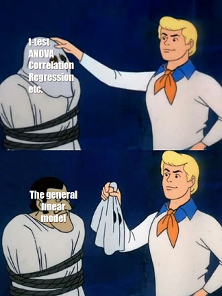
How Linear Regression and Two-Way ANOVA are the Same
Why ANOVA and Linear Regression are the Same
The Connected, Intelligent, Automated Industry 4.0 Supply Chain
Imperfect Action is Better Than Perfect Inaction: What Harry Truman Can Teach Us About Loss Functions (with an intro to ggplot)
Lack of Alignment is an Organizational Disease. Here are the Symptoms.
Next Page
Privacy & Cookies: This site uses cookies. By continuing to use this website, you agree to their use.
To find out more, including how to control cookies, see here:
Cookie Policy
Subscribe
Subscribed
Quality and Innovation
Join 255 other subscribers
Sign me up
Already have a WordPress.com account?
Log in now.
Quality and Innovation
Subscribe
Subscribed
Sign up
Log in
Report this content
View site in Reader
Manage subscriptions
Collapse this bar