Category Archives: Lean Six Sigma

Agile vs. Lean: Explained by Cats

Over the past few years, Agile has gained popularity. This methodology emerged as a solution to manage projects with a number of unknown elements and to counter the typical waterfall method. Quality practitioners have observed the numerous similarities between this new framework and Lean. Some have speculated that Agile is simply the next generation’s version of Lean. These observations have posed the question: Is Agile the new Lean?  

ASQ Influential Voices Roundtable for December 2019

The short answer to this question is: NO.

The longer answer is one I’m going to have to hold back some emotions to answer. Why? I have two reasons.

Reason #1: There is No Magic Bullet

First, many managers are on a quest for the silver bullet — a methodology or a tool that they can implement on Monday, and reap benefits no later than Friday. Neither lean nor agile can make this happen. But it’s not uncommon to see organizations try this approach. A workgroup will set up a Kanban board or start doing daily stand-up meetings, and then talk about how they’re “doing agile.” Now that agile is in place, these teams have no reason to go any further.

Reason #2: There is Nothing New Under the Sun

Neither approach is “new” and neither is going away. Lean principles have been around since Toyota pioneered its production system in the 1960s and 1970s. The methods prioritized value and flow, with attention to reducing all types of waste everywhere in the organization. Agile emerged in the 1990s for software development, as a response to waterfall methods that couldn’t respond effectively to changes in customer requirements.

Agile modeling uses some lean principles: for example, why spend hours documenting flow charts in Visio, when you can just write one on a whiteboard, take a photo, and paste it into your documentation? Agile doesn’t have to be perfectly lean, though. It’s acceptable to introduce elements that might seem like waste into processes, as long as you maintain your ability to quickly respond to new information and changes required by customers. (For example, maybe you need to touch base with your customers several times a week. This extra time and effort is OK in agile if it helps you achieve your customer-facing goals.)

Both lean and agile are practices. They require discipline, time, and monitoring. Teams must continually hone their practice, and learn about each other as they learn together. There are no magic bullets.

Information plays a key role. Effective flow of information from strategy to action is important for lean because confusion (or incomplete communication) are forms of waste. Agile also emphasizes high-value information flows, but for slightly different purposes — that include promoting:

  • Rapid understanding
  • Rapid response
  • Rapid, targeted, and effective action

The difference is easier to understand if you watch a couple cat videos.

This Cat is A G I L E

From Parkour Cats: https://www.youtube.com/watch?v=iCEL-DmxaAQ

This cat is continuously scanning for information about its environment. It’s young and in shape, and it navigates its environment like a pro, whizzing from floor to ceiling. If it’s about to fall off something? No problem! This cat is A G I L E and can quickly adjust. It can easily achieve its goal of scaling any of the cat towers in this video. Agile is also about trying new things to quickly assess whether they will work. You’ll see this cat attempt to climb the wall with an open mind, and upon learning the ineffectiveness of the approach, abandoning that experiment.

This Cat is L E A N

From “How Lazy Cats Drink Water”: https://www.youtube.com/watch?v=FlVo3yUNI6E

This cat is using as LITTLE energy as possible to achieve its goal of hydration. Although this cat might be considered lazy, it is actually very intelligent, dynamically figuring out how to remove non-value-adding activity from its process at every moment. This cat is working smarter, not harder. This cat is L E A N.

Hope this has been helpful. Business posts definitely need more cat videos.

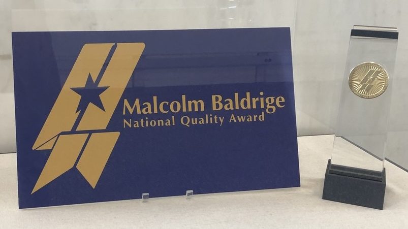
How the Baldrige Process Can Enrich Any Management System

Another wave of reviewing applications for the Malcolm Baldrige National Quality Award (MBNQA) is complete, and I am exhausted — and completely fulfilled and enriched!

That’s the way this process works. As a National Examiner, you will be frustrated, you may cry, and you may think your team of examiners will never come to consensus on the right words to say to the applicant! But because there is a structured process and a discipline, it always happens, and everyone learns.

I’ve been working with the Baldrige Excellence Framework (BEF) for almost 20 years. In the beginning, I used it as a template. Need to develop a Workforce Management Plan that’s solid, and integrates well with leadership, governance, and operations? There’s a framework for that (Criterion 5). Need to beef up your strategic planning process so you do the right thing and get it done right? There’s a framework for that (Criterion 2).

Need to develop Standard Work in any area of your organization, and don’t know where to start (or, want to make sure you covered all the bases)? There’s a framework for that.

Every year, 300 National Examiners are competitively selected from industry experts and senior leaders who care about performance and improvement, and want to share their expertise with others. The stakes are high… after all, this is the only award of its kind sponsored by the highest levels of government!

Once you become a National Examiner (my first year was 2009), you get to look at the Criteria Questions through a completely different lens. You start to see the rich layers of its structure. You begin to appreciate that this guidebook was carefully and iteratively crafted over three decades, drawing from the experiences of executives and senior leaders across a wide swath of industries, faced with both common and unique challenges.

The benefits to companies that are assessed for the award are clear and actionable, but helping others helps examiners, too. Yes, we put in a lot of volunteer hours on evenings and weekends (56 total, for me, this year) — but I got to go deep with one more organization. I got to see how they think of themselves, how they designed their organization to meet their strategic goals, how they act on that design. Our team of examiners got to discuss the strengths we noticed individually, the gaps that concerned us, and we worked together to come to consensus on the most useful and actionable recommendations for the applicant so they can advance to the next stage of quality maturity.

One of the things I learned this year was how well Baldrige complements other frameworks like ISO 9001 and lean. You may have a solid process in place for managing operations, leading continuous improvement events, and sustaining the improvements. You may have a robust strategic planning process, with clear connections between overall objectives and individual actions.

What Baldrige can add to this, even if you’re already a high performance organization, is:

  • tighten the gaps
  • call out places where standard work should be defined
  • identify new breakthrough opportunities for improvement
  • help everyone in your workforce see and understand the connections between people, processes, and technologies

The whitespace — those connections and seams — are where the greatest opportunities for improvement and innovation are hiding. The Criteria Questions in the Baldrige Excellence Framework (BEF) can help you illuminate them.

Using xda with googlesheets in R

Image Credit: Doug Buckley of http://hyperactive.to

Image Credit: Doug Buckley of http://hyperactive.to

Want to do a quick, exploratory data analysis in R of your data that’s stored in a spreadsheet on Google Drive? You’re in luck, because now you can use the new xda package in conjunction with Jenny Bryan‘s googlesheets. There are some quirks, though, and that’s what this post is all about.

Before proceeding, you should review this recent article from R-Bloggers called “Introducing xda”.

First, be sure to install the googlesheets and xda packages. Although googlesheets is on CRAN, xda is not, and you’ll have to bring it in directly from github. You can actually do the same for googlesheets if you like:

install.packages("devtools")
library(devtools)
install_github("jennybc/googlesheets")
install_github("ujjwalkarn/xda")
library(googlesheets)
library(xda)

Next, you’ll have to show R how to access your Google spreadsheet. While you are looking at your spreadsheet, go to File -> Publish to the Web. The URL that’s in the text box is the one you want to capture. Just to make sure it works, copy and paste it into a new browser address window and see if you can display your spreadsheet in your browser.

If you want to import the data at https://docs.google.com/spreadsheets/d/1DO0ksD8d-rn_j2Yn7DQKZDPBrhrvZTpgszewxokjWKU/pubhtml into R, for example, you’ll need to know the spreadsheet’s key. That’s the long string of unintelligible numbers and letters between the “d” and the “pubhtml”. So, my key would be “1DO0ksD8d-rn_j2Yn7DQKZDPBrhrvZTpgszewxokjWKU” — which you’ll see in this next block of code:

> my.gs <- gs_key("1DO0ksD8d-rn_j2Yn7DQKZDPBrhrvZTpgszewxokjWKU") 
> my.data <- gs_read(my.gs) # Retrieves data from googlesheets and places it into an R object. 
> my.df <- as.data.frame(my.data)  # Important! xda needs you to extract only the data in a data frame.

Now, you can access your data. Try head(my.df) to make sure you’ve imported it properly.

Next, it’s time for exploratory data analysis. There are three commands available:

  • numSummary – takes a data frame as an argument, provides descriptive statistics, quantiles, and missing data info for quantitative variables
  • charSummary – takes a data frame as an argument, provides counts, missing data info, and number of unique factors for quantitative variables
  • bivariate – takes a data frame and two quantitative variables as an argument, and performs a quick bivariate analysis (giving this categorical variables, or giving this one categorical and one quantitative variable, will throw an error)

Here’s what happens when you run those commands on the data you just loaded in from your Google spreadsheet:

> numSummary(my.df)
               n   mean    sd median   max  min  mode miss miss%    1%   5%   25%   50%   75%   90%   95%   99%
obs          200 100.50 57.88  100.5 200.0  1.0   1.0    0     0  2.99 11.0  50.8 100.5 150.2 180.1 190.0 198.0
heartrates   200  73.01  7.43   73.0  96.3 53.4  71.2    0     0 56.49 61.2  68.4  73.0  77.4  82.6  85.7  90.3
systolics    200 139.27 29.27  138.0 221.0 59.0 139.0    0     0 79.98 96.0 117.0 138.0 160.0 177.2 188.1 205.0
diastolics   200  87.76  9.74   87.7 116.4 62.4  85.2    0     0 66.01 72.2  81.9  87.7  93.7 100.3 104.5 108.3
bmis         200  25.53  3.06   25.0  33.1 18.4  24.7    0     0 19.00 21.0  23.5  25.0  27.7  29.6  31.2  32.8
ages         200  44.41 14.59   45.0  70.0 18.0  30.0    0     0 18.00 22.0  32.0  45.0  57.0  64.1  67.0  70.0
heartpm      200  72.26  3.55   72.2  83.8 64.2  74.2    0     0 64.72 66.2  69.8  72.2  74.2  76.4  78.7  81.4
fitnesslevel 200   2.62  1.17    3.0   4.0  1.0   4.0    0     0  1.00  1.0   2.0   3.0   4.0   4.0   4.0   4.0

> charSummary(my.df)
          n miss miss% unique
genders 200    0     0      2
smokers 200    0     0      2
group   200    0     0      4

> bivariate(my.df,'heartrates','bmis')
     bin_bmis min_heartrates max_heartrates mean_heartrates
1   (18.3,22]          53.40          85.60           72.80
2   (22,25.7]          55.70          90.70           72.87
3 (25.7,29.4]          60.30          96.30           73.45
4 (29.4,33.1]          56.50          90.30           72.46

Observations:

  • There is a fourth “Plot” command but I couldn’t get it to work on any googlesheetsdata. The xda package is looking for class(range) to be anything other than “function”, which it was for every sheet I attempted to load.
  • There really should be an extra column in xda that displays the enumeration of all the unique values for the factors. It felt great to know how many unique values there were, but I would love to be reminded of what they are too, unless there are too many of them.

Please share your experiences using xda & googlesheets together in the comments! Thanks!

Control Charts in R: A Guide to X-Bar/R Charts in the qcc Package

xbar-chartStatistical process control provides a mechanism for measuring, managing, and controlling processes. There are many different flavors of control charts, but if data are readily available, the X-Bar/R approach is often used. The following PDF describes X-Bar/R charts and shows you how to create them in R and interpret the results, and uses the fantastic qcc package that was developed by Luca Scrucca. Please let me know if you find it helpful!

Creating and Interpreting X-Bar/R Charts in R

A Simple Intro to Bayesian Change Point Analysis

The purpose of this post is to demonstrate change point analysis by stepping through an example of the technique in R presented in Rizzo’s excellent, comprehensive, and very mathy book, Statistical Computing with R, and then showing alternative ways to process this data using the changepoint and bcp packages. Much of the commentary is simplified, and that’s on purpose: I want to make this introduction accessible if you’re just learning the method. (Most of the code is straight from Rizzo who provides a much more in-depth treatment of the technique. I’ve added comments in the code to make it easier for me to follow, and that’s about it.)

The idea itself is simple: you have a sample of observations from a Poisson (counting) process (where events occur randomly over a period of time). You probably have a chart that shows time on the horizontal axis, and how many events occurred on the vertical axis. You suspect that the rate at which events occur has changed somewhere over that range of time… either the event is increasing in frequency, or it’s slowing down — but you want to know with a little more certainty. (Alternatively, you could check to see if the variance has changed, which would be useful for process improvement work in Six Sigma projects.)

You want to estimate the rate at which events occur BEFORE the shift (mu), the rate at which events occur AFTER the shift (lambda), and the time when the shift happens (k). To do it, you can apply a Markov Chain Monte Carlo (MCMC) sampling approach to estimate the population parameters at each possible k, from the beginning of your data set to the end of it. The values you get at each time step will be dependent only on the values you computed at the previous timestep (that’s where the Markov Chain part of this problem comes in). There are lots of different ways to hop around the parameter space, and each hopping strategy has a fancy name (e.g. Metropolis-Hastings, Gibbs, “reversible jump”).

In one example, Rizzo (p. 271-277) uses a Markov Chain Monte Carlo (MCMC) method that applies a Gibbs sampler to do the hopping – with the goal of figuring out the change point in number of coal mine disasters from 1851 to 1962. (Looking at a plot of the frequency over time, it appears that the rate of coal mining disasters decreased… but did it really? And if so, when? That’s the point of her example.) She gets the coal mining data from the boot package. Here’s how to get it, and what it looks like:

library(boot)
data(coal)
y <- tabulate(floor(coal[[1]]))
y <- y[1851:length(y)]
barplot(y,xlab="years", ylab="frequency of disasters")

coalmine-freq

First, we initialize all of the data structures we’ll need to use:

# initialization
n <- length(y) # number of data elements to process
m <- 1000 # target length of the chain
L <- numeric(n) # likelihood fxn has one slot per year
k[1] <- sample(1:n,1) # pick 1 random year to start at
mu[1] <- 1
lambda[1] <- 1
b1 <- 1
b2 <- 1
# now set up blank 1000 element arrays for mu, lambda, and k
mu <- lambda <- k <- numeric(m)

Here are the models for prior (hypothesized) distributions that she uses, based on the Gibbs sampler approach:

  • mu comes from a Gamma distribution with shape parameter of (0.5 + the sum of all your frequencies UP TO the point in time, k, you’re currently at) and a rate of (k + b1)
  • lambda comes from a Gamma distribution with shape parameter of (0.5 + the sum of all your frequencies AFTER the point in time, k, you’re currently at) and a rate of (n – k + b1) where n is the number of the year you’re currently processing
  • b1 comes from a Gamma distribution with a shape parameter of 0.5 and a rate of (mu + 1)
  • b2 comes from a Gamma distribution with a shape parameter of 0.5 and a rate of (lambda + 1)
  • a likelihood function L is also provided, and is a function of k, mu, lambda, and the sum of all the frequencies up until that point in time, k

At each iteration, you pick a value of k to represent a point in time where a change might have occurred. You slice your data into two chunks: the chunk that happened BEFORE this point in time, and the chunk that happened AFTER this point in time. Using your data, you apply a Poisson Process with a (Hypothesized) Gamma Distributed Rate as your model. This is a pretty common model for this particular type of problem. It’s like randomly cutting a deck of cards and taking the average of the values in each of the two cuts… then doing the same thing again… a thousand times. Here is Rizzo’s (commented) code:

# start at 2, so you can use initialization values as seeds
# and go through this process once for each of your m iterations
for (i in 2:m) {
 kt <- k[i-1] # start w/random year from initialization
 # set your shape parameter to pick mu from, based on the characteristics
 # of the early ("before") chunk of your data
 r <- .5 + sum(y[1:kt]) 
 # now use it to pick mu
 mu[i] <- rgamma(1,shape=r,rate=kt+b1) 
 # if you're at the end of the time periods, set your shape parameter
 # to 0.5 + the sum of all the frequencies, otherwise, just set the shape
 # parameter that you will use to pick lambda based on the later ("after")
 # chunk of your data
 if (kt+1 > n) r <- 0.5 + sum(y) else r <- 0.5 + sum(y[(kt+1):n])
 lambda[i] <- rgamma(1,shape=r,rate=n-kt+b2)
 # now use the mu and lambda values that you got to set b1 and b2 for next iteration
 b1 <- rgamma(1,shape=.5,rate=mu[i]+1)
 b2 <- rgamma(1,shape=.5,rate=lambda[i]+1)
 # for each year, find value of LIKELIHOOD function which you will 
 # then use to determine what year to hop to next
 for (j in 1:n) {
 L[j] <- exp((lambda[i]-mu[i])*j) * (mu[i]/lambda[i])^sum(y[1:j])
 }
 L <- L/sum(L)
 # determine which year to hop to next
 k[i] <- sample(1:n,prob=L,size=1)
}

Knowing the distributions of mu, lambda, and k from hopping around our data will help us estimate values for the true population parameters. At the end of the simulation, we have an array of 1000 values of k, an array of 1000 values of mu, and an array of 1000 values of lambda — we use these to estimate the real values of the population parameters. Typically, algorithms that do this automatically throw out a whole bunch of them in the beginning (the “burn-in” period) — Rizzo tosses out 200 observations — even though some statisticians (e.g. Geyer) say that the burn-in period is unnecessary:

> b <- 201 # treats time until the 200th iteration as "burn-in"
> mean(k[b:m])
[1] 39.765
> mean(lambda[b:m])
[1] 0.9326437
> mean(mu[b:m])
[1] 3.146413

The change point happened between the 39th and 40th observations, the arrival rate before the change point was 3.14 arrivals per unit time, and the rate after the change point was 0.93 arrivals per unit time. (Cool!)
After I went through this example, I discovered the changepoint package, which let me run through a similar process in just a few lines of code. Fortunately, the results were very similar! I chose the “AMOC” method which stands for “at most one change”. Other methods are available which can help identify more than one change point (PELT, BinSeg, and SegNeigh – although I got an error message every time I attempted that last method).

> results <- cpt.mean(y,method="AMOC")
> cpts(results)
cpt 
 36 
> param.est(results)
$mean
[1] 3.2500000 0.9736842
> plot(results,cpt.col="blue",xlab="Index",cpt.width=4)

coalmine-changepoint

I decided to explore a little further and found even MORE change point analysis packages! So I tried this example using bcp (which I presume stands for “Bayesian Change Point”) and voila… the output looks very similar to each of the previous two methods!!!):

coalmine-bcp

It’s at this point that the HARD part of the data science project would begin… WHY? Why does it look like the rate of coal mining accidents decreased suddenly? Was there a change in policy or regulatory requirements in Australia, where this data was collected? Was there some sort of mass exodus away from working in the mines, and so there’s a covariate in the number of opportunities for a mining disaster to occur? Don’t know… the original paper from 1979 doesn’t reveal the true story behind the data.

There are also additional resources on R Bloggers that discuss change point analysis:

(Note: If I’ve missed anything, or haven’t explained anything right, please provide corrections and further insights in the comments! Thank you.

What (Really) is a Data Scientist?

Drew Conway's very popular Data Science Venn Diagram. From http://drewconway.com/zia/2013/3/26/the-data-science-venn-diagram

Drew Conway’s very popular Data Science Venn Diagram. From http://drewconway.com/zia/2013/3/26/the-data-science-venn-diagram

What is a data scientist? What makes for a good (or great!) data scientist? It’s been challenging enough to determine what a data scientist really is (several people have proposed ways to look at this). The Guardian (a UK publication) said, however, that a true data scientist is as “rare as a unicorn”.

I believe that the data scientist “unicorn” is hidden right in front of our faces; the purpose of this post is to help you find it. First, we’ll take a look at some models, and then I’ll present my version of what a data scientist is (and how this person can become “great”).

#1 Drew Conway’s popularData Science Venn Diagram” — created in 2010 — characterizes the data scientist as a person with some combination of skills and expertise in three categories (and preferably, depth in all of them): 1) Hacking, 2) Math and Statistics, and 3) Substantive Expertise (also called “domain knowledge”). 

Later, he added that there was a critical missing element in the diagram: that effective storytelling with data is fundamental. The real value-add, he says, is being able to construct actionable knowledge that facilitates effective decision making. How to get the “actionable” part? Be able to communicate well with the people who have the responsibility and authority to act.

“To me, data plus math and statistics only gets you machine learning, which is great if that is what you are interested in, but not if you are doing data science. Science is about discovery and building knowledge, which requires some motivating questions about the world and hypotheses that can be brought to data and tested with statistical methods. On the flip-side, substantive expertise plus math and statistics knowledge is where most traditional researcher falls. Doctoral level researchers spend most of their time acquiring expertise in these areas, but very little time learning about technology. Part of this is the culture of academia, which does not reward researchers for understanding technology. That said, I have met many young academics and graduate students that are eager to bucking that tradition.”Drew Conway, March 26, 2013

#2 In 2013, Harlan Harris (along with his two colleagues, Sean Patrick Murphy and Marck Vaisman) published a fantastic study where they surveyed approximately 250 professionals who self-identified with the “data science” label. Each person was asked to rank their proficiency in each of 22 skills (for example, Back-End Programming, Machine Learning, and Unstructured Data). Using clustering, they identified four distinct “personality types” among data scientists:

As a manager, you might try to cut corners by hiring all Data Creatives(*). But then, you won’t benefit from the ultra-awareness that theorists provide. They can help you avoid choosing techniques that are inappropriate, if (say) your data violates the assumptions of the methods. This is a big deal! You can generate completely bogus conclusions by using the wrong tool for the job. You would not benefit from the stress relief that the Data Developers will provide to the rest of the data science team. You would not benefit from the deep domain knowledge that the Data Businessperson can provide… that critical tacit and explicit knowledge that can save you from making a potentially disastrous decision.

Although most analysts and researchers who do screw up very innocently screw up their analyses by stumbling into misuses of statistical techniques, some unscrupulous folks might mislead other on purpose; although an extreme case, see I Fooled Millions Into Thinking Chocolate Helps Weight Loss.

Their complete results are available as a 30-page report (available in print or on Kindle).

#3 The Guardian is, in my opinion, a little more rooted in realistic expectations:

“The data scientist’s skills – advanced analytics, data integration, software development, creativity, good communications skills and business acumen – often already exist in an organisation. Just not in a single person… likely to be spread over different roles, such as statisticians, bio-chemists, programmers, computer scientists and business analysts. And they’re easier to find and hire than data scientists.”

They cite British Airways as an exemplar:

“[British Airways] believes that data scientists are more effective and bring more value to the business when they work within teams. Innovation has usually been found to occur within team environments where there are multiple skills, rather than because someone working in isolation has a brilliant idea, as often portrayed in TV dramas.”

Their position is you can’t get all those skills in one person, so don’t look for it. Just yesterday I realized that if I learn one new amazing thing in R every single day of my life, by the time I die, I will probably be an expert in about 2% of the package (assuming it’s still around).

#4 Others have chimed in on this question and provided outlines of skill sets, such as:

  • Six Qualities of a Great Data Scientist: statistical thinking, technical acumen, multi-modal communication skills, curiosity, creativity, grit
  • The Udacity blog: basic tools (R, Python), software engineering, statistics, machine learning, multivariate calculus, linear algebra, data munging, data visualization and communication, and the ultimately nebulous “thinking like a data scientist”
  • IBM: “part analyst, part artist” skilled in “computer science and applications, modeling, statistics, analytics and math… [and] strong business acumen, coupled with the ability to communicate findings to both business and IT leaders in a way that can influence how an organization approaches a business challenge.”
  • SAS: “a new breed of analytical data expert who have the technical skills to solve complex problems – and the curiosity to explore what problems need to be solved. They’re part mathematician, part computer scientist and part trend-spotter.” (Doesn’t that sound exciting?)
  • DataJobs.Com: well, these guys just took Drew Conway’s Venn diagram and relabeled it.

#5 My Answer to “What is a Data Scientist?”:  A data scientist is a sociotechnical boundary spanner who helps convert data and information into actionable knowledge.

Based on all of the perspectives above, I’d like to add that the data scientist must have an awareness of the context of the problems being solved: social, cultural, economic, political, and technological. Who are the stakeholders? What’s important to them? How are they likely to respond to the actions we take in response to the new knowledge data science brings our way? What’s best for everyone involved so that we can achieve sustainability and the effective use of our resources? And what’s with the word “helps” in the definition above? This is intended to reflect that in my opinion, a single person can’t address the needs of a complex data science challenge. We need each other to be “great” at it.

A data scientist is someone who can effectively span the boundaries between

1) understanding social+ context, 

2) correctly selecting and applying techniques from math and statistics,

3) leveraging hacking skills wherever necessary,

4) applying domain knowledge, and

5) creating compelling and actionable stories and connections that help decision-makers achieve their goals. This person has a depth of knowledge and technical expertise in at least one of these five areas, and a high level of familiarity with each of the other areas (commensurate with Harris’ T-model). They are able to work productively within a small team whose deep skills span all five areas.

It’s data-driven decision making embedded in a rich social, cultural, economic, political, and technological context… where the challenges may be complex, and the stakes (and ultimately, the benefits) may be high. 


(*) Disclosure: I am a Data Creative!

(**)Quality professionals (like Six Sigma Black Belts) have been doing this for decades. How can we enhance, expand, and leverage our skills to address the growing need for data scientists?

Sampling Distributions and Central Limit Theorem in R

The Central Limit Theorem (CLT), and the concept of the sampling distribution, are critical for understanding why statistical inference works. There are at least a handful of problems that require you to invoke the Central Limit Theorem on every ASQ Certified Six Sigma Black Belt (CSSBB) exam. The CLT says that if you take many repeated samples from a population, and calculate the averages or sum of each one, the collection of those averages will be normally distributed… and it doesn’t matter what the shape of the source distribution is! (Caveat: so long as the data comes from a distribution with finite variance… so that means the Cauchy distribution doesn’t count.)

I wrote some R code to help illustrate this principle for my students. This code allows you to choose a sample size (n), a source distribution, and parameters for that source distribution, and generate a plot of the sampling distributions of the mean, sum, and variance. (Note: the sampling distribution for the variance is a Chi-square distribution — if your source distribution is normal!)

sdm.sim <- function(n,src.dist=NULL,param1=NULL,param2=NULL) {
   r <- 10000  # Number of replications/samples - DO NOT ADJUST
   # This produces a matrix of observations with  
   # n columns and r rows. Each row is one sample:
   my.samples <- switch(src.dist,
	"E" = matrix(rexp(n*r,param1),r),
	"N" = matrix(rnorm(n*r,param1,param2),r),
	"U" = matrix(runif(n*r,param1,param2),r),
	"P" = matrix(rpois(n*r,param1),r),
        "B" = matrix(rbinom(n*r,param1,param2),r),
	"G" = matrix(rgamma(n*r,param1,param2),r),
	"X" = matrix(rchisq(n*r,param1),r),
	"T" = matrix(rt(n*r,param1),r))
   all.sample.sums <- apply(my.samples,1,sum)
   all.sample.means <- apply(my.samples,1,mean)   
   all.sample.vars <- apply(my.samples,1,var) 
   par(mfrow=c(2,2))
   hist(my.samples[1,],col="gray",main="Distribution of One Sample")
   hist(all.sample.sums,col="gray",main="Sampling Distribution\nof
	the Sum")
   hist(all.sample.means,col="gray",main="Sampling Distribution\nof the Mean")
   hist(all.sample.vars,col="gray",main="Sampling Distribution\nof
	the Variance")
}

There are 8 population distributions to choose from: exponential (E), normal (N), uniform (U), Poisson (P), binomial (B), gamma (G), Chi-Square (X), and the Student’s t distribution (T). Note also that you have to provide either one or two parameters, depending upon what distribution you are selecting. For example, a normal distribution requires that you specify the mean and standard deviation to describe where it’s centered, and how fat or thin it is (that’s two parameters). A Chi-square distribution requires that you specify the degrees of freedom (that’s only one parameter). You can find out exactly what distributions require what parameters by going here: http://en.wikibooks.org/wiki/R_Programming/Probability_Distributions.

Here is an example that draws from an exponential distribution with a mean of 1/1 (you specify the number you want in the denominator of the mean):

sdm.sim(50,src.dist="E",param1=1)

The code above produces this sequence of plots:

sd-blog-1

You aren’t allowed to change the number of replications in this simulation because of the nature of the sampling distribution: it’s a theoretical model that describes the distribution of statistics from an infinite number of samples. As a result, if you increase the number of replications, you’ll see the mean of the sampling distribution bounce around until it converges on the mean of the population. This is just an artifact of the simulation process: it’s not a characteristic of the sampling distribution, because to be a sampling distribution, you’ve got to have an infinite number of samples. Watkins et al. have a great description of this effect that all statistics instructors should be aware of. I chose 10,000 for the number of replications because 1) it’s close enough to infinity to ensure that the mean of the sampling distribution is the same as the mean of the population, but 2) it’s far enough away from infinity to not crash your computer, even if you only have 4GB or 8GB of memory.

Here are some more examples to try. You can see that as you increase your sample size (n), the shapes of the sampling distributions become more and more normal, and the variance decreases, constraining your estimates of the population parameters more and more.

sdm.sim(10,src.dist="E",1)
sdm.sim(50,src.dist="E",1)
sdm.sim(100,src.dist="E",1)
sdm.sim(10,src.dist="X",14)
sdm.sim(50,src.dist="X",14)
sdm.sim(100,src.dist="X",14)
sdm.sim(10,src.dist="N",param1=20,param2=3)
sdm.sim(50,src.dist="N",param1=20,param2=3)
sdm.sim(100,src.dist="N",param1=20,param2=3)
sdm.sim(10,src.dist="G",param1=5,param2=5)
sdm.sim(50,src.dist="G",param1=5,param2=5)
sdm.sim(100,src.dist="G",param1=5,param2=5)
« Older Entries