Skip to content
(c) 2008-2024
Quality and Innovation
Search
About Nicole
Books
Consulting
Contact
Courses
Influential Voices (ASQ)
Posts (2008-2012)
Category:
featured
Agile vs. Lean: Explained by Cats
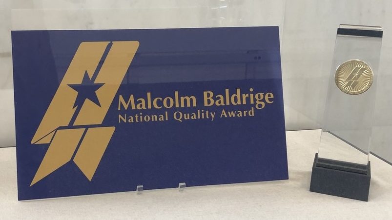
How the Baldrige Process Can Enrich Any Management System
An Easy Way to Make Minimum Viable Product (MVP) Totally Not Viable
Imperfect Action is Better Than Perfect Inaction: What Harry Truman Can Teach Us About Loss Functions (with an intro to ggplot)
The Achilles Heel of Customer Journey Mapping
Privacy & Cookies: This site uses cookies. By continuing to use this website, you agree to their use.
To find out more, including how to control cookies, see here:
Cookie Policy
Subscribe
Subscribed
Quality and Innovation
Join 255 other subscribers
Sign me up
Already have a WordPress.com account?
Log in now.
Quality and Innovation
Subscribe
Subscribed
Sign up
Log in
Report this content
View site in Reader
Manage subscriptions
Collapse this bar